 In 2006 when Twilight was published in the UK it looked like this. What were they thinking? This cover conveys nothing about Twilight. You’d never think it was an angsty romance between cranky teen girl, Bella, and perennial teenage virgin vampire, Edward.
This would be a great cover if it was about a terrifying three-metre tall alien takeover of a high school. Or as Jennifer Laughran suggested a tale of about an elven princess who joins the military. I would totally read either one of those books. But it does not match Twilight. Especially when you compare this cover to the US stark black with red apple in hands one, which perfectly captures the book.
You will be unsurprised to learn that Twilight tanked when it first came out in the UK. It only took off after rejacketing with the original US cover.1
Jackets matter. OMG do they matter. They have to convey what the book is about, they have to make you want to pick up the book. If you read the book and it doesn’t resemble the cover—in a way that makes you feel lied to—you are likely to be cross.
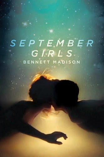
 A few years ago the wonderful Bennett Madison had a book out called September Girls, which is a gorgeous and weird poetic meditation on masculinity, femininity and misogyny. Yet look at the cover.
To me it screams summer romance. Possibly one that will tug at your heart strings, be a bit melancholy and wry. But definitely a romance. September Girls is not a romance. This is entirely the wrong cover.
A book that is published as a romance—as opposed to a book that is romantic or a love story—has to have a happy ever after ending and the romance has to be the A plot. The very centre of the novel. September Girls is not remotely a romance. It’s almost the opposite of a romance.
Some of the book’s first readers reacted badly to it.2 I’m convinced that part of that was because of the misleading jacket. (Though it didn’t put off the leading review journals who gave September Girls many much-deserved starred reviews.)
I am sympathetic to this reaction. I have read books that were billed as romances that did not have happy endings and I was most displeased. I read romances at least partly because of the surety of that happy ending. I often read them when I really need a happy ending. It feels like a punch in the stomach if I don’t get one. The cover lied to me! Unacceptable!
But there are other books where the cover doesn’t match the story and I’m not angry because it feels more surprising than a lie. For example, I find both Jenny Han and Sarah Dessen’s books to be more complicated and interesting than their breezy, summery covers led me to believe. But it felt like a bonus not a minus.
Why does this happen? Many people have input into the final jacket of a book. Not just the editor, but also sales and marketing, as well as the major accounts they’re trying to sell to. Some of those people won’t have read the book. That means they’re only looking at what they think will sell. It’s harder for them to judge whether the cover is a good match for the book.
The other factor is that many readers don’t seem to care. Publishers have seen books with misleading covers do really well. And as with Han and Dessen sometimes misleading is not a bad thing.
It’s incredibly hard to get the right cover. I celebrate every time my books get a cover that doesn’t make me cry. Which, I hasten to add, has been for most of my career. I’ve been very lucky. What covers do you think most successfully convey the book within?
- I’m doubtful that would happen these days. Social media buzz would have been so huge that UK readers would have been clamouring for Twilight and would have overlooked the cover. Or maybe they would have just ordered the US edition. Who knows? [↩]
- If you’re interested you can check out g**dreads. But don’t say I didn’t warn you. [↩]


It took me longer than it should have to read JELLICOE ROAD because I didn’t find the cover appealing. Then, one day I randomly picked it up, read the first couple pages, and was hooked. It’s been one of my favorites and most recommended for years now, but I almost overlooked it because of the cover (which I like more now, in retrospect).
The US cover for Bonnie-Sue Hitchcock’s THE SMELL OF OTHER PEOPLE’S HOUSES is one of my favorites and, after reading the book, I feel like its a perfect fit for the novel. It’s one of the few books I’ve ever loved as much as JELLICOE ROAD, so that feels oddly fitting.
Do you mean this cover? Which Jellicoe Road cover did you bounce off?
I admit that I’m frequently put off books by the cover but I can’t say which because they’re by YA writers I know. 🙂
Yes, that’s the one!
And the JELLICOE cover was the US one. I don’t think its changed at all…
https://www.goodreads.com/book/show/2999475-jellicoe-road
I think, at a glance, it isn’t very appealing, but I like it more when I sit and look at it!
I must have strange taste in book covers because I really liked the original UK cover for Twilight, that was the cover that made me pick it up and read it. I think it was true to the book in how Bella felt like an outsider at school, but once the cover has made me pick up a book I don’t really mind of the story doesn’t match what I expected.
I have to agree about the cover for September Girls, if I saw that on the shelves I wouldn’t be inspired to pick it up at all. However your little recap there “a gorgeous and weird poetic meditation on masculinity, femininity and misogyny. ” means I’m now adding it to my Mount TBR 🙂
“What were they thinking” was likely rhetorical, but in case it wasn’t, I will add my two cents as a graphic designer who has worked on book covers: there is often a woeful lack of budget for good design.
Cover designers are often being budgeted for 3-5 hours of work. That doesn’t include time for research, believe me, and considering a good cover design takes a lot longer than 3-5 hours they’re likely making even less.
Spending the time to read the book and fully understand its themes and nuances becomes a very low priority. The designer has other projects to move on to if they want to make ends meet. The synopsis becomes the brief.
Then the cover gets passed along to marketing who perhaps hasn’t read the whole book either for the same reasons. It makes for weaker covers on books that sell poorly so the publisher cuts back on the designers budget for the next one to hedge bets. Round and round we go.
If you look at that UK Twilight cover as “Teenage girl moves to a new town to discover her high school has vampires” it suddenly makes more sense.