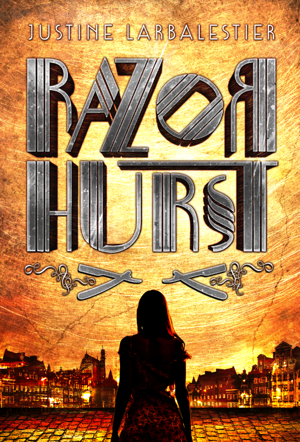
US Cover of Razorhurst

I’m super excited to reveal what Razorhurst will look like when Soho Teen publish it in the USA next March. Quite a contrast to the Australian cover, eh? Yet at the same time they both have that gorgeous, strong font treatment.

RazorhurstUS

I adore that font and those colours. I hope you do too. Everyone who’s seen this cover has been wildly enthusiastic uttering comments like, “I would buy that in a heartbeat.” “Utterly beautiful.” “Wow, that’s so commercial.” All of it music to my ears.

Soho’s edition will have a bonus glossary. Yes, you US readers are going to be spoiled. It also means the USA Razorhurst will be my first novel to have both a glossary and a map.1 That’s right, Soho are keeping the beautiful map used in the Allen and Unwin edition. Still gorgeous, isn’t it?

Map designed by Hannah Janzen

Map designed by Hannah Janzen

Map plus glossary? What could be cooler? Nothing. I can’t wait until all my US readers can get their hands on Razorhurst. March is so soon, youse guys!

  1. Razorhurst is my fifth novel with a glossary. Because I love them: Words, definitions, dictionaries, glossaries, they are all my dearest loves. []

BWFBC: Patricia Highsmith’s The Price of Salt/Carol (1952)

Welcome to July’s Bestselling Women’s Fiction Book Club in which we discuss Patricia Highsmith’s The Price of Salt/Carol. It’s original title was The Price of Salt and that’s what some editions in the US still call it. In Australia and the UK it’s called Carol. That’s how I think of it because that’s the edition I first read and fell in love with in my early twenties.

This is the first book we’ve discussed that one of us knows really well. I’m a huge Highsmith fan. Have read everything she’s published as well as all the biographies and memoirs of her I can find. So this discussion is a little different from the previous ones.

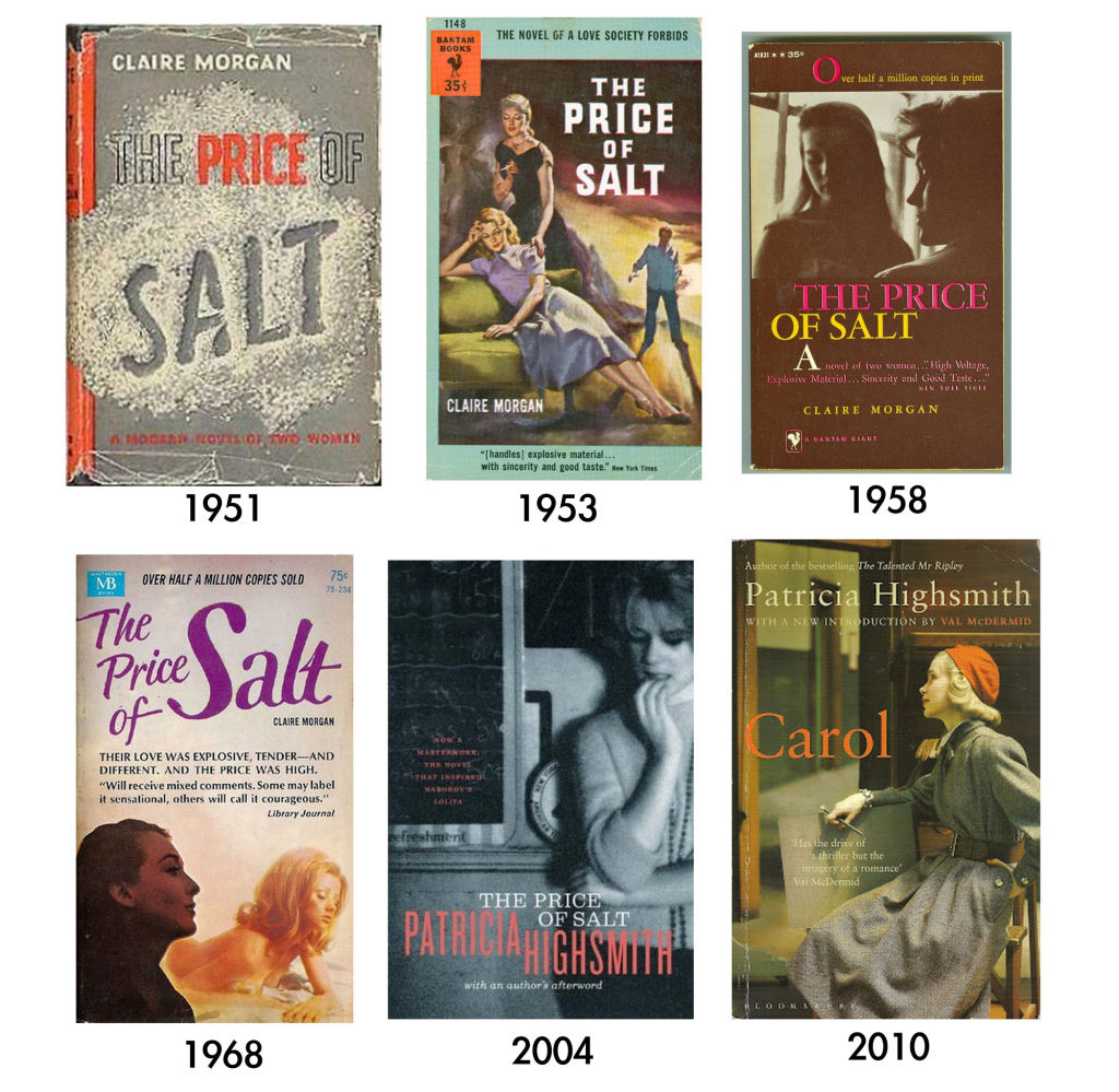
Because the book was originally published as a hardcover but did not take off until the paperback edition came out1 I thought it would be fun for you to see the different covers. Quite the difference, eh? From what I’ve been able to figure out it was that second version that sold the most copies. At least one of the dates in the image bleow is wrong. The hardcover version of Price of Salt was first published in 1952, not 1951.


Note: in the discussion below my information about the original publication of the book and how many copies it sold comes from Patricia Highsmith’s 1989 afterword which is now included in most reprints of the book. She says almost a million copies. As you can see some of the paperback covers above claim only half a million.

One last thing: apparently Todd Haynes is currently directing Cate Blanchett in a movie version to be called Carol. Yes, I’m excited.

For the discussion on Twitter we’ll be using the hashtag #BWFBC. You can also join the conversation in the comments below.

If you haven’t read Price of Salt/Carol yet there are many spoilers below.

And here at last is our take on this bloody brilliant book:

JL: This is my third or fourth read so I’d really like to hear your take on it first. Very curious to know what you thought.

KE: I’m about a third through.

I think it is quite well written. And I’m really impressed by how she captures Therese’s stunned attraction. Also, something about Highsmith’s point of view is so interesting to me and I’m not sure I can put my finger on it. Maybe because the situation doesn’t feel as desperate as some of the other books where we can tell from the subject matter and the tone that a dire fate awaits the women characters. This isn’t precisely a comedy, but it is a book in which there is a fragile sense that a woman can contribute to her own destiny? That she has a hope of happiness and success of a kind? Does that make sense?

I’m enjoying it. The initial phone call exchange where Carol rings up and realizes who it is who called her is brilliant.

JL: Yes to all of that. Except that I think Highsmith is a genius and her writing perfect.

The pov is deeply strange. It verges on omniscient.

The description of Therese’s desire, love, obsession is remarkable. Every time I read it I’m absolutely desperate for them to kiss already. WHY AREN’T YOU BOTH KISSING ALREADY?! And I do mean kissing. They barely so much as hold hands for most of the book. Sexual tension = this book.

I can’t help thinking how disappointed the 1950s straight men who read lesbian pulps for the titilation must’ve been with this book and how beyond delighted the lesbians must have been to discover it. No wonder it was an underground hit.

Have you finished yet? Didn’t want to write more of my thought until you’ve finished.

I will say this one thing since it’s clear that Richard is like this early on. I’m struck by how in every single novel we’ve looked at there’s a guy who will not take no for an answer and who pathologises the woman for her refusal to marry him/be with him.

KE: Yes. Richard doesn’t seem bad at first but then it turns out he’s awful. Dannie is better because of he isn’t bothered (seemingly) by the revelation that Therese has had an affair with Carol, and because he genuinely does seem like a person who will not demand.

The man who won’t take no for an answer is a familiar and comfortable trope, still present today in guises that make such a man seem worthy and attractive, but in all these novels the writers simply skewer that notion.

JL: It’s lovely to see that revulsion at that guy is not a recent development. He’s been loathed for much longer than either of us has been alive. And yay for that! Now if only we could get him to go away forever.

I just reread Malinda Lo’s review of the book. I was really struck by how weird I found it that she saw it as a love at first sight novel. I didn’t read it that way at all. I mean Carol doesn’t even realise that it was Therese at first she thought it was some guy who served her that day. Carol pretty clearly isn’t immediately attracted to Therese it’s more of a slow burn. The falling in love is even a slower burn. I feel like Carole doesn’t even take Therese seriously until she realises that she’s a set designer.

Therese is very much attracted straight away. But that’s not love at first sight that’s lust at first sight which I’ve never found hard to buy at all.

Your thoughts?

KE: I absolutely read it as Therese falling in love at first sight. Carol feels the attraction but, I think, is mature and experienced enough to be amused by it because she knows what it is.

But I simply can’t agree that it is lust at first sight.

JL: Wow. I think I have a totally different understanding of what love at first sight as a narrative device is compared to you and Malinda. Because I really disagree. I’ve always seen it at as something that happens to both in the pairing—a la Twilight or Tristan and Isolde. They might struggle against it but they both feel it. A narrative in which only one person is into the other is not a love at first sight narrative.

Carol definitely does not feel it. She doesn’t even remember who Therese is at first and if Therese hadn’t contacted her Carol would never have thought of her again.

Therese feels an attraction—I think it’s lust—that she doesn’t quite make sense of until she sees Carol a few more times. But, yeah, I think her immediate attraction to Carol is physical. And that she lets herself understand it as something more romantic because she doesn’t quite have the means to understand being attracted to a woman. It’s part of what she tries to talk to idiot Richard about when she asks him if he’s ever been attracted to a man. So, yeah, I definitely feel the attraction is instant but the love comes later.

I don’t read Therese as truly being in love with Carol or even truly understanding Carol until the very end of the novel when she’s wowed by Carol’s bravery in deciding to be with Therese even though it means she’s going to lose her daughter.

One of the many things I adore about this novel is that it shows the reader Therese and Carol getting to know each other fairly slowly and falling in love fairly slowly. Therese learns that Carol is not, in fact, who she thought she was.

KE: Therese is so sure of herself and how these feelings permeate her. I think it’s beautifully written in capturing the sense of floating and surety. Besides the really good writing I think what I love most about this book is that Therese never questions herself, never hates herself for having what most people at that time (and too many even now) considered “unnatural” feelings. The power of the emotion that hits her is so strong that she simply accepts it in a way that might typically be written in a heterosexual romance of the time (and still today). There’s no agonizing forr her, it’s Cupid’s arrow straight between the eyes. I love that. Although over the course of the novel Therese slowly comes to realize what it means for her and Carol in terms of society’s disapprobation and the real threat it poses to both of them for different reasons.

JL: Here we can agree. (Though I think Cupid fires lust darts, not love.) I adored Therese’s surety about her own desires too. And it’s a huge part of why it sold almost a million copies in paperback and caused so many lesbians and gay men to write to Highsmith about the novel. Here was a story where a woman falls in love with another woman without believing that she’s deranged or infantile or any of the things that awful Richard acuses her of being. Here’s a story in which the lovers get to be together at the end.

KE: So, yes, put me firmly in the love at first sight camp.

Carol’s is a slower burn but I read that in part as caution and, as you say, in part that at first she seems to find Therese more amusing (and maybe a little flattering) than anything.

(Very true about Cupid. My bad.)

JL: If she’s a slow burner than how on earth is it love at first sight?! That makes no sense! I read it as Carol being depressed. Her ex is awful, she’s just broken up with her best friend, her daughter’s with her awful ex, she has a housekeeper she doesn’t trust, she has no job to distract her. So, yes, as you say she’s enjoying the flattery of Therese’s crush on her but doesn’t take it seriously beyond that. She’s certainly not imagining them living together. Pretty much until they go on the road trip Carol tries to encourage Therese to stick with her odious boyfriend.

KE: The set design does change Carol’s view of her. I wonder if you have any thoughts in how Carol reacts (with the negative criticism)? It could be seen as a compliment (I’m being honest) or as a little more passive aggressive. Or some other option. It’s interesting though.

JL: For me that’s the first moment Carol starts to really see Therese and not just the flattery of this pretty young thing having a crush on her.

I read her criticism as part of Carol’s general discomfort. Carol’s up against so much that she’s not talking about. Two break ups in a row. She’s constantly kind of on edge and irritable and I see the picking at Therese’s designs as another part of that. She spends a lot of time trying to push Therese away. And there’s a lot of weirdness around her break up with Abby and Abby’s interaction with Therese. I also think she’s a bit freaked out by her growing feelings for Therese and the ramifications for Carol. She is, as you say, much more aware of the consequences of being a lesbian in the 1950s in the USA than Therese is.

I’m coming out of YA where there’s a metric tonne of love at first sight in the sense I mean it. In the fairy tale sense. And YA is where Malinda is from as well which is how I read her as responding to the book: “Oh, God, not that awful trope again.” Whereas I think this novel is SO not that trope.

However, I still don’t see Therese as instantly in love. Intrigued and crushing, yes. Full of desire, yes. In love? No. I also see a very slight amount of omniscience in the narrator. Through those eyes I feel like the novel is very lightly mocking—mocking is too strong a word—Therese’s growing obsession with Carol. But there’s a definite feel of someone much older telling the tale of this nineteen year old’s first real experience with love.

KE: If you are defining “love at first sight” as necessarily mutual, then no it isn’t. But I’ve never defined it as having to be mutual.

In Carol’s case, she even says toward the end that she went over to Therese in the department store because she was the least busy, and not wearing a smock.

JL: I don’t think either of them really start to fall all the way in love with each other until the road trip when they get to know each other and discover they have great chemistry in bed.

KE: Nah. I just disagree. Therese is in love from the get-go, although I should specify that I think of it as infatuation-love rather than love-love, if that makes sense. But it is not just lust. The emotion made Therese stronger and more sure of herself. Lust (to my mind) doesn’t create the same grounding.

JL: It’s lust with romantic longings. That ain’t what I call love. I do not call infatuation love. I call love what you’re calling love-love. So I think we’re agreeing but we have definitional disagreements. Frankly I don’t believe in love at first sight. I believe in lust at first sight, infatuation at first sight, but not love. Love takes time. You can’t love someone if you don’t know them.

KE: I should note that I myself am skeptical about the idea of love at first sight. On a personal note I actually have a statement about “love at first sight” in my forthcoming YA fantasy novel, in which a father tells his daughter about the first time he saw her mother. He emphatically does not believe in “love at first sight” and then describes what pretty much what in any book would be “love at first sight.”

I should also note that from my own experience I know that “instant attraction” (sometimes sexual but often a more intangible quality that is an instinctive “connection” between two people) does exist but I have experienced it with both men and women. It always startles me when I instantly like and feel drawn to someone (even as I know I don’t really know them, but something sparks that connection and I am sure I have no idea what it is).

JL: Yes to all of that.

KE: I’m enjoying your analysis of Carol. I think in this case that is a perspective that can’t be gained from a single reading of the novel but only from a re-read.

JL: It is true *cough* that this is at least my fourth read of this novel. It fascinated me because it is so not like Highsmith’s other books yet at the same I can see so many places where it could take a turn into Highsmith territory. Like when awful ex, Harge, shows up, there’s a moment where either Therese or Carol could plausibly have killed him. The fact that Carol brings a gun on the road trip and it never goes off! If this were a regular Highsmith Carol could have wound up killing that detective.

KE: Yes, I recognized the business with the gun and felt it was, perhaps, a tip of the hat to her thrillers? I was pretty sure it would not go off because the tone of the story wasn’t right for it, but it was a reminder that the entire narrative could have taken a far darker turn.

JL: Oh, I like that interpretation. Hadn’t occurred to me. It’s just the sort of thing Highsmith would do too.

KE: What’s interesting is that I think the story may have been far more important to readers because it did not take that dark turn.

JL: Absolutely!

KE: The ending is brilliant and adorable, and the cinematic romantic in me is just beaming because it is so sweet and yet somehow Highsmith pulls it off without making it saccharine; she makes you want it.

JL: The first time I read it I cried. Sobbed my heart out with joy. Not just because it’s a (relatively) happy ending but because they’re both now in a place and the novel takes place over at least a year and a half where they’re right for each other, mature enough for each other, and brave enough for each other. *sniff*

KE: I must say that I did feel a pinch of anger at Therese for that business of “she choose Rindy over me” because I’m a mother and so I entirely empathize with Carol’s situation. Having said that, Highsmith has carefully set up that Therese has no reason to understand “motherly love” as she never got any and, in fact, was herself discarded when her mother chose her second husband over Therese. So it makes psychological sense.

JL: Oh, sure. I also think it’s meant to be a bit appalling. Even without her awful background Therese is still very young. It’s a very young person’s selfish thought.

KE: So while Therese’s story ends well, Carol’s remains filled with a combination of triumph and heartbreak, very bittersweet. In my fanfic, Rindy will start writing secret letters to her mother and then, as 16, will start seeing her mother secretly and, at 18, tell her father where to go.

JL: That’s hilarious. I was going to tell you that I imagine Rindy constantly running away from her dad until he finally gives in and lets her go live with Carol and Therese. He won’t mind because he’s found himself another trophy wife and had more children. And Rindy’s proven herself to be too much trouble.

But, yes, my heart breaks for Carol.

One of the lovely things at the end of the book is that we finally get to see Carol without all those weights on her. She knows, at last, where she stands with her ex, she’s lost custody of her daughter. She doesn’t have to hide. She doesn’t have to pretend anymore. That brittleness about her is gone.

KE: The only thing that mitigates my annoyance with the plot device of Carol having to lose her child in order to be “free” (very dicey plot device, that one) is that I know that legally it would and could have happened in that way. But in this particular case the plot line of a mother losing her child always comes across to me as traumatic.

JL: It happened to a close family friend in the 1970s. Lesbian mothers didn’t start winning custody battles til later in that decade. At least not in Australia and I bet it was just as bad in the US. So I never thought of that as a plot device but rather as absolutely what would have happened. Because that’s what did happen. Sometimes still does happen.

I also think is clear Carol doesn’t see losing Rindy as making her free. She’s clearly heartbroken. But in the choice between denying who she is to people who hate her and won’t to keep her from her daughter and will use any excuse to do so she chooses love with Therese.

KE: I’ve thought a bit more about this and I realize that in fact Carol doesn’t read to me as heartbroken and in fact her relationship with Rindy never felt true to me; it is the one thing in the book that doesn’t ring true to me. It feels obligatory but not emotionally authentic. So it isn’t the plot device that didn’t work for me — the legal aspect — it’s that I never quite believed in the mother/daughter relationship as depicted between them so that it came across as a plot device rather than something I truly cared about because I never (as a reader) invested in the Carol/Rindy relationship. All the other relationships felt true to me, even the minor ones like Mrs Robichek.

JL: Again I disagree. One of the things I’ve noticed on rereads is that Therese is not a reliable narrator though she absolutely strives to be one (which is a key distinction between kinds of unreliable narrators). but everything about Carol is filtered through her gaze. Therese does not give a shit about Rindy. She doesn’t much ask about Rindy except in a pro forma way. So Carol doesn’t much talk about Rindy with Therese. Yet even so she’s there haunting the entire book and a huge part of Carol’s grief and brittleness. When letters arrive Carol always reads Rindy’s first. And Therese is puzzled by that. To me that was a huge tell that Therese just doesn’t get Carol’s love for her daughter.

KE: If that is the case, and I think you make a compelling argument about something that might not be as obvious EXCEPT on a re-read, then there’s a second layer to all this in that Therese essentially acts as did the second husband for whom her mother discarded her. It would be interesting to think about how and what it means that, as an abandoned child, she can’t (yet) empathize with a girl about to be separated from her mother.

I wanted to make a brief mention of how brilliantly Highsmith uses excerpts from letters. She’s such a skilled writer, and it’s interesting to see how the narrative voice differs from the voices displayed in the letters (naturally, but it’s not easy to do).

JL: As I have now mentioned multiple times I am a huge fan. Can I admit now that you’re initial comment that Highsmith writes “quite well” had me fuming? Yay, that you saw the light. 🙂

KE: Justine, “quite well” is a huge compliment from me. I don’t gush much. If I say, “that was a good book” it is strong praise.

JL: Weirdo.

KE: Probably!

There is a period of several chapters where Therese does a cascade of “growing up” that turns her into a person of budding maturity and—quite the most interesting to me—a woman with determined goals and a sense of herself. She is a woman who will succeed and also be true to herself (in many different facets of her life). Wow. What a fabulous emotion to leave the reader with.

JL: Yes to all of this. I too think that was beautifully done, which I guess is pretty obvious given how many times I’ve read it.

KE: I would like to hear more about the context of this book’s bestsellerdom because I confess it surprised me that a book with this content would have been a bestseller in 1952. I’m not surprised people wrote to Highsmith. Again, I can’t express enough how unusual it is EVEN TODAY but especially then to read a lovely story like this in which her sexual coming out (if I may use that term) is depicted so positively, and sexily. And without any need to ever have Therese question, doubt, dislike, or try to “change” herself.

JL: It may not be technically a bestseller. But it did sell close to a million copies and it was one of the bestselling lesbian pulp paperbacks of the 1950s. It did not do well in its original printing in hardcover though it got some nice reviews including from the NYT. But it’s real impact was in paperback.

Those lesbian pulps were mainly aimed at titilating straight male readers but many lesbians also read them and I’m pretty sure this novel would have stood out like a sore thumb. It became a novel that was passed around by lesbians and by which they could recognise each other. Marijane Meaker (M. E. Kerr) was one of Highsmith’s lovers and talks about the book’s impact in her 2003 memoir about her relationship with Highsmith:

Pat was revered [in the lesbian community] for her pseudonymous novel, The Price of Salt, which had been published in 1952 by Coward McCann. It was for many years the only lesbian novel, in either hard or soft cover, with a happy ending.

It stood on every lesbian bookshelf along with classics like The Well of Loneliness; We, Too, Are Drifting; Diana; and Olivia.

KE: The book dragged for me a little in the middle, mostly because I was waiting for dragons or ninjas to appear and they never did. But the ending is really masterfully written.

JL: You do realise that there will be no dragons or ninjas in any of the books we’re looking at, right?

KE: WHAT?!?!?

So glad you had us read this one! I’d never even heard of it. But then again, because of the lack of dragons and ninjas and sword fighting, I tend not to have heard of a lot of mainstream fiction.

Our Next Book: Winifred Holtby’s South Riding (1936) Join us at the end of August to discuss the first English book we’re looking at. You can see the whole year’s schedule here.

  1. Pun intentional. []

My Next Published Solo Novel: RAZORHURST!

My next novel, Razorhurst, will be published in Australia and New Zealand by Allen & Unwin in July. That’s right, its publication is a mere five months away! Which is practically right now.

I’m delighted to be working with Allen & Unwin on Razorhurst. They have published all but three of my books of fiction. Razorhurst is my fifth novel with them, which means they are now the publisher with which I’ve had the longest association. It’s really wonderful to have such a great home for my books in Australia.

Meanwhile in the USA Razorhust is going to be published by Soho Teen (an imprint of Soho Press) in March 2015! Which is only slightly more than a year away, which is basically almost tomorrow. Time moves very, very quickly these days. Especially in North America. I believe the Time Speed Up was caused by the Polar Vortex. Or something. *cough*

Soho Teen only publish twelve books a year and they put their full promotional weight behind each one. I’ve been hearing great things for awhile now and am very excited to be working with them.

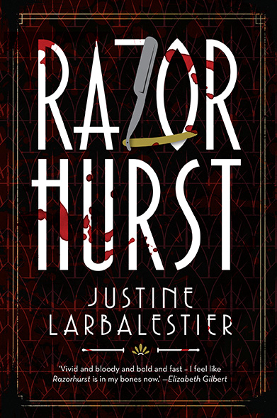
Here is the Australian cover of Razorhurst:

RazorhurstOzCover

Pretty fabulous, isn’t it? I think it screams pick me up and read me.

What is Razorhurst about?

Here’s how Allen & Unwin are describing it:

The setting: Razorhurst, 1932. The fragile peace between two competing mob bosses—Gloriana Nelson and Mr Davidson—is crumbling. Loyalties are shifting. Betrayals threaten.

Kelpie knows the dangers of the Sydney streets. Ghosts have kept her alive, steering her to food and safety, but they are also her torment.

Dymphna is Gloriana Nelson’s ‘best girl’, experienced in surviving the criminal world, but she doesn’t know what this day has in store for her.

When Dymphna meets Kelpie over the corpse of Jimmy Palmer, Dymphna’s latest boyfriend, she pronounces herself Kelpie’s new protector. But Dymphna’s life is in danger too, and she needs an ally. And while Jimmy’s ghost wants to help, the dead cannot protect the living . . .

Razorhurst is my bloodiest book with the highest body count.1 It was a very violent time in Sydney’s history and my book reflects that. There’s also loads of friendship and love and, um, rose petals in it.

Why is it called Razorhurst?

Razorhurst was the name Sydney’s tabloid newspaper Truth gave the inner-city Sydney suburb of Darlinghurst. However, the crimes that outraged the paper also took place in Surry Hills, King’s Cross, and other parts of inner-city Sydney. Here’s a little snippet of Truth‘s September 1928 cri de coeur for tougher anti-crime laws:

Razorhurst, Gunhurst, Bottlehurst, Dopehurst—it used to be Darlinghurst, one of the finest quarters of a rich and beautiful city; today it is a plague spot where the spawn of the gutter grow and fatten on official apathy . . .

Inadequate policing and an out-of-date Crimes Act are the fertilisers of this Field of Evil. Truth demands that Razorhurst be swept off the map, and the Darlinghurst we knew in betters days be restored . . .

Recall the human beasts that, lurking cheek by jowl with crime—bottle men, dope pedlars, razor slashers, sneak thieves, confidence men, women of ill repute, pickpockets, burglars, spielers, gunmen and every brand of racecourse parasite. What an army of arrogant and uncontrolled vice!

As a result of what goes on daily—thanks to the Crimes Act, thanks to under-policing—Razorhurst grows more and more undesirable as a place of residence for the peaceful and the industrious. Unceasingly it attracts to its cesspool every form of life that is vile.

Isn’t that fabulous? Such rabble rousing fury. I could go on quoting Truth all day long. It’s the most entertaining tabloid I’ve ever read and certainly the one most addicted to alliteration. Sample headline: Maudlin Magistrates Who Molly-coddle Mobsters.2 Doing the research for Razorhurst meant reading quite a bit of Truth. And even though it’s only available on microfiche, which means you have to squint and constantly readjust the focus, it was still so much fun to read. Tabloids are not what they used to be.

What inspired you to write Razorhurst?

I moved to the inner-city Sydney suburb of Surry Hills and started learning more about its notorious history.3 Our home is around the corner from Frog Hollow, which was once one of Sydney’s most notorious slums. And we’re only a few streets away from where crime boss and Queen of Surry Hills, Kate Leigh, once lived.

I read Larry Writer’s Razor: Tilly Devine, Kate Leigh and the razor gangs, a non-fiction account of inner-city Sydney’s razor gangs in the twenties and thirties. Around the same time I came across Crooks Like Us by Peter Doyle and City of Shadows by Peter Doyle with Caleb Williams. These are two books of Sydney Police photographs from 1912-1960. The photos of crime scenes, criminals, victims, missing persons and suspects are extraordinarily vivid black and white pictures which evoke the dark side of Sydney more richly than any other resource I have come across. You can look at them here. Or if you’re in Sydney you can go see them at the Justice and Police Museum. The exhibition is on until the end of the year.

TL;DR: My next novel, Razorhurst, is out in Australia and New Zealand in July 2014; and in the USA in March 2015. There is blood.

  1. Mind you, that was not hard to achieve given that no one dies in my trilogy or in How To Ditch Your Fairy or Team Human and the death in Liar takes place before the book starts. (Or does it? And was there really only one death in Liar? I could be lying but only because I’m contractually obligated to do so.) So, really, a body count of one means that Razorhurst is bloodier than my other novels. []
  2. Truth, Sunday, January 3, 1932. []
  3. It’s very much not like that anymore. Check out this little characterisation of Surry Hills these days. As a resident I would like to point out it’s not entirely like that either. []

Sekrit Project Revealed!

I have very exciting NEWS!

I wrote a book! The book is sold! It will be out early next year!

Even more exciting and this is the best part: I DID NOT WRITE THIS BOOK ALONE.

I wrote it with Sarah Rees Brennan, who is not only a wonderful friend, but one of my favourite writers.

The book is called Team Human. It will be published by Allen & Unwin in Australia and Harper Collins in North America and will be out 3 July 2012.

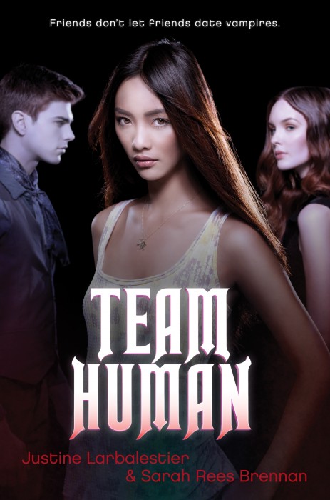
And here is the cover, which totally proves this is all real:

(We got to sit in on the photo shoot for it. Fancy, huh?)

Writing Team Human was the most fun I’ve ever had writing a book. All because of SRB.

For those of you who are unfamiliar with her—and seriously how did that happen? what are you doing reading this blog when you could be reading hers or, even better, her wonderful books—SRB is the author of the Demon’s Lexicon trilogy, which are some of the scariest, most gut wrenchingest awesome books I’ve read. Your heart will be seared as you read!1

Oh, and she’s funny too. Just read her blog. Seriously funny. In fact, it was her funniness that led to Team Human. We were instant messaging each other2 discussing a movie we’d just seen and she kept making me laugh so hard I fell over3 and somehow we got talking about a million and one extremely funny things and then we found ourselves agreeing to write a book together. For the full story check out SRB’s version of events.

Now, I have planned to write books with many people and each time we’ve both earnestly assured each other that we were going to truly rooly do this thing. But every time something would get in the way. They were already writing a book with someone else, we could not come up with enough good ideas, if we did come up with good ideas the enthusiasm would die, one or both of us was too busy, etc. etc.

Not this time. I don’t think it ever occurred to SRB that we wouldn’t write a complete novel. It occurred to me. I have never been as shocked as when I realised we were really, literally, actually4 going to write a complete finished book together! It was almost as surprising as the first time I did that on my own.5

I should have realised sooner that we would finish because almost straight away we were swapping chapters back and forth, doing our best to make the other laugh6. Such larks were had! Though I can see why I was full of doubt, apart from all the usual stuff that can get in the way, it’s kind of hilarious how completely different SRB and mine’s writing styles are. We must have the least compatible writing methods ever.

Readers, SRB made me outline. I know! It was HORRIBLE. We had to figure out Every Little Thing ahead of time. Who does that? Madness! She expected me to know who our cast of characters were before we started writing them! Who does that? Sane people figure out that kind of stuff as they write.

How could I have known SRB would put me through such torture? Other than this interview we did with each other on how she outlines and I wing it, I mean. (Actually reading that exchange between us gives you a very accurate idea of how we wrote a book together and of what kind of book we wrote. Hint: it involves slutty hamsters. Sort of.)

So, yes, extremely detailed outlining = very traumatic. Yet, somehow I survived and the book was written.7

And there’s a sequel! Which we are writing RIGHT NOW. Which was also outlined ahead of time.8 It will be published a year after the first in early 2013 by Allen & Unwin and Harper Collins.

And that is my big big news that we’ve had to keep secret for way too long. I hope you are a tenth as excited as I am!9

  1. Not literally. That would be bad. []
  2. Back in the days when I could do that without searing pain. Hmmm, “sear” seems to be my verb of the day. Sorry about that. []
  3. Literally. I was bruised! []
  4. Anything I said about not overusing the word “actually” on twitter clearly does not apply to this blog. *cough* []
  5. To be honest, I am always surprised when I realise I’m going to finish a book. I have started way more of them than I have ever finished. []
  6. I don’t think I ever caused SRB to fall over though. One day . . . []
  7. Though I continue to not outline my solo books. Agressively so. Which is probably why they take me so long. Oh, well. []
  8. Aaaarrrrggghhh!!! []
  9. If you were as excited as me you might die and no one wants that. []

Zombies versus Unicorns Cover

Today mine & Holly Black’s Zombies v Unicorn anthology was featured on EW’s Shelf Life, the press release went out, and the Simon & Schuster’s official Z v U page is officially official.1 Go there to vote Team Zombie—my team—because zombies are superior to unicorns in every way.

Over the next few months leading up to the antho’s publication in September I will have much to say about it. But today I wanted to talk about the art because it is so spectactular that I’m still pinching myself. I love it!2 The artist, Josh Cochran, has surpassed himself with his Heironymous-Bosch-meets-Where’s-Waldo epic art.3

Feast your eyes:


And do click on the art to see it in its much bigger glory.

What could be cooler than that? Well, how about the fact that it’s going to go on the boards of the book. Yup, for the first time in my publishing career, a book of mine will look just fine without a dustjacket. A book of mine is going to look good NAKED. Happiness!

But do not panic: the glorious art will not be totally concealed by the dustjacket. Oh, no, Simon & Schuster are going with a three-quarter black dust jacket so that you can see the magnificent zombie v unicorn battle peeking out of the dj. It’s going to be absolutely spectactular. I cannot wait to see the final book. In fact, not since my first book was published have I ever been so eager to see the final book.

Note: A few of the people I’ve shown this art to seem to be under the misapprehension that the unicorns are winning. Not so! What they clearly do not realise is that zombies are many, unicorns are few. In fact, every unicorn in the universe is depicted in this art. Whereas the legions and legions of zombies wait at its edges. Unicorns are So. Very. Doomed.

  1. Yes, those of you on Twitter already know about it. That’s because being on Twitter makes you special. Give yourself a special Twitter hug. []
  2. For those who seem to have been confused on that subject in the past you can tell that I love this cover because I wrote “I love it.” Rather than, say, telling you that other people love it. []
  3. Tip of hat to Diana Peterfreund for the Where’s Waldo part of the mashup. []

Race & Representation

Because there has been another whitewashed cover, I am being asked for my response.1 I have one thing to say:2

This is not about the accuracy of covers on books.

It’s not about blonde when the character is brunette, it’s not about the wrong length hair, or the wrong colour dress, it’s not even about thin for fat. Yes, that is another damaging representation, but that is another conversation, which only serves to derail this conversation.

The one about race and representation.

Sticking a white girl on the cover of a book about a brown girl is not merely inaccurate, it is part of a long history of marginalisaton and misrepresentation. Publishers don’t randomly pick white models. It happens within a context of racism.

Back in the late 1960s, Nichelle Nichols was asked by Martin Luther King to stay on Star Trek, even though she was sick of the boring, constrained part of Uhura. She was one of the few black faces on network TV. She was inspiring thousands of young black girls all over the USA, possibly the world. Nichols playing Uhura was changing lives and so he asked her to stay and she did.

Ari of Reading in Color reminds us about those young black kids and why this is so incredibly important in her moving open letter to Bloomsbury:

I’m sure you can’t imagine what it’s like to wander through the teen section of a bookstore and only see one or two books with people of color on them. Do you know how much that hurts? Are we so worthless that the few books that do feature people of color don’t have covers with people of color? It’s upsetting, it makes me angry and it makes me sad. Can you imagine growing up as a little girl and wanting to be white because not only do you not see people who look like you on TV, you don’t see them in your favorite books either. You get discouraged and you want to be beautiful and be like the characters in the books you read and you start to believe that you can’t be that certain character because you don’t look like them. I love the books I grew up with, but none of them featured people of color. I found those later, when I was older and I started looking for them. Do you know how sad I feel when my middle school age sister tells me she would rather read a book about a white teen than a person of color because “we aren’t as pretty or interesting.” She doesn’t know the few books that do exist out there about people of color because publishing houses like yourself, don’t put people of color on the covers.

That is what this is about: pervasive racism in every aspect of our world so that young kids grow up thinking they are inferior because they see so few reflections of themselves.

This is not merely about book covers.

  1. Journalists would do better to interview the people most adversely affected by whitewashed covers—readers like Ari of Reading in Color. []
  2. Well, two. Stop blaming the author, Jaclyn Dolamore. This is her debut. Take it from me, she’d rather people were talking about her book than about her cover. Also I am very suspicious of this approach. It feels like derailing. “Let’s not talk about race, let’s talk about bad authors!” Hey, let’s not. []

Covers

The most discussed aspect of a book, other than whether it’s any good, is its cover. But looking around online and off- at gazillions of different cover discussions the cover’s main function is sometimes forgotten. Thus I’ve decided to devote today’s post to talking about what a cover is and how they’re made.

When a publisher buys a book one of the first things they start thinking about is how to sell it. Who is its ideal audience? How can they position the book so those readers will find it? How can they position it so they expand beyond those readers? These discussions quickly wind up with ideas for the cover. That’s because the most important function of a book cover is

To sell the book.

That’s right, folks, a book cover is an advertisement. Typically, ads don’t go after the existing customers, they go after new ones. A cover that’s totally true to the book might make the author’s heart go pitter pat and please mad-keen fans, but if it works only for author and hard-core fans, it is not a successful cover.1 A successful cover calls out to people who’ve never heard of the book or the author and says, “Pick me up! Read me! Buy me!”

A successful cover expands your audience. Other than word of mouth, the cover is the most important factor in selling a book. Often it is the biggest and best, or even, only advertisement for the book.

Uglies is Scott’s most successful series. The first book in the series, Uglies, was an original paperback that went out into the world with little fanfare. But, wow, did that cover attract a lot of attention. Scott has had countless letters from fans telling him that they picked the book up because of the cover. That it called to them from across many aisles. That cover is a huge part of why Uglies did so well.2

How is a cover made at the big publishing houses?

Typically3 the first step is for editorial to put together a cover brief and send it to the art department. A cover brief is a description of what they’d like the cover to look like and/or the element of the book they’d like to see reflected in the cover.

The artists who design the covers tend not to read the books they’re working on because they don’t have time. They’re working on so many books in a year and their deadlines are so tight they barely have time to read the cover brief. On top of that sometimes the book they’re working on hasn’t been written yet. (Or, at least, not finished.)

Next a series of rough ideas are sent back to editorial. There is discussion and one or more direction is pursued. Then editorial okays one and the art department completes it. Sometimes editorial changes its mind and sends art in another direction. Once editorial likes the cover it’s sent to sales and marketing to be approved. Sometimes it isn’t and the process has to start over. The next important approval comes from the big accounts, the stores that order the books. Sometimes if they don’t like a cover it gets redesigned.

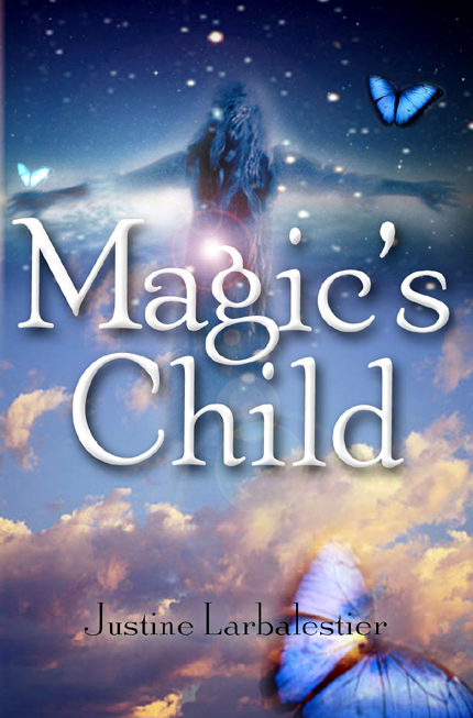
Something else to remember: all of this starts a long time before the book comes out because—have I mentioned this already?—the cover is the single most important part of advertising the book. Sometimes the book isn’t even finished and the cover is. The cover of Magic’s Child was completed before the first draft of the book was, which was weird, though it gave me time to add more butterflies to the text.

Another important consideration that you can’t actually do anything about is how the book will look when it’s in the bookstores. I.e. will the cover pop. You can design the most gorgeous eye-catching cover in the world in luscious golds and browns and rusts and then have it disappear on the new releases table because guess what? Every book that season is a a luscious blend of golds and browns and rust. But that book in the white and teal that everyone was worried about? Pops like you wouldn’t believe. You can see that book the minute you step foot in the store.

See how random that is? And because of such randomness no one really knows what makes a cover sell. Lots of books fail utterly despite everyone—from author to publishing house to the big booksellers to reviewers—believing the cover to be utterly gorgeous. There are last-minute, emergency covers that everyone’s nervous about that sell like gangbusters. Sometimes you’re sure a cover’s going to sell great and it does; sometimes it does not. The unpredictability leads to all sorts of superstitious nonsense in publishing houses. Green doesn’t sell! Illustrated covers on YA never works! Never put a chicken on the front of a middle grade! A skeleton on the front means the book is doomed! Etc. etc.

There are also house styles. Publishing companies that have had a lot of success with a certain kind of cover are keen to keep using that look and loathe to experiment. Especially if past experiments have failed. Now, with the recession, publishing companies and the big accounts are being more cautious and conservative than usual with the result that are an awful lot of same-same covers out there. But many of those covers are selling.

I’m sure I’ve missed some important aspects. Remember that I’m an author, while we’re part of the publishing industry, we’re also at a remove from it. There are authors who’ve published multiple books, who still don’t understand how their royalty statements work,4 or what co-op, or a P&L is. Yes, I am also a publishing geek and have spent the last decade asking questions, but I’ve never worked in a publishing house. Actual people who work at publishing houses no way more than I do about this.

If you have any questions or information to add fire away!

  1. Ideally you want a cover that works for those who know and love the book as well as for those who’ve never heard of it. But such covers are rare and wonderful beasties. []
  2. Initially, that it keeps on selling is due to its own goodness. []
  3. It varies from house to house and book to book. []
  4. I’ll admit I’m one of them. []

US edition of Liar will publish on time

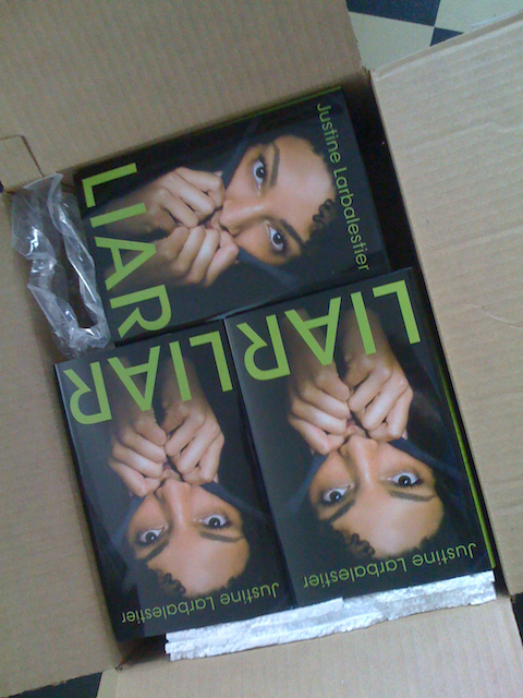
Because of the jacket change there was a wee bit of doubt that the US edition of Liar would be available on its scheduled release date of 29 September. I’m here to tell you that it most definitely will be available on that date. In fact, I wouldn’t be surprised if it shows up in book shops ahead of schedule.

How do I know?

Because of this:

Yup, those are my author’s copies of Liar. They’re here and it’s only the beginning of September. I’d say we’re good to go.

Quickly Answering Some Recent Questions About Liar

Yes, the new cover means that it is unlikely possible that Liar will may not be available in US and Canadian stores on the announced publication date of 29 September. I don’t know what the new pub date is but it will definitely be in October. As soon as I know I’ll pass it on. Update: My US publisher says there’s still a strong possibility Liar will be available at the end of September as planned. (Note: this is the hardcover first edition of Liar I am talking about. There will not be a North American paperback until next year.)

There is no planned UK edition as UK rights have not sold. The English language editions, both to be published in October, are the Australian one published by Allen & Unwin and the North American version published by Bloomsbury.

There will also be an audio version read by the amazing Channie Waites (scroll down to see the photo of her) for Bolinda in Australia and Brilliance in the USA. I was able to sit in on part of the recording session and plan to blog about that incredible experience (with pictures) next week. (Short version: my work brought to life! OMG!)

If you prefer to read in languages other than English Liar will also be published in Brazil, France, Germany, Italy, Taiwan, and Turkey. I have no details yet on when those editions will appear.

I am hoping for a manga version, because I am always hoping for manga versions of my work. So far there has not been the faintest hint of a nibble in that direction for any of my books. Personally, I think How To Ditch Your Fairy would make the best manga series ever.

If you have any other questions fire away. I promise to answer them all even if it’s just to say, “Why are you asking me about stalactites? I don’t know anything about them. I can’t even remember if they’re the sticky up-y ones or the pointy down-y ones.”

The New Cover (Updated)

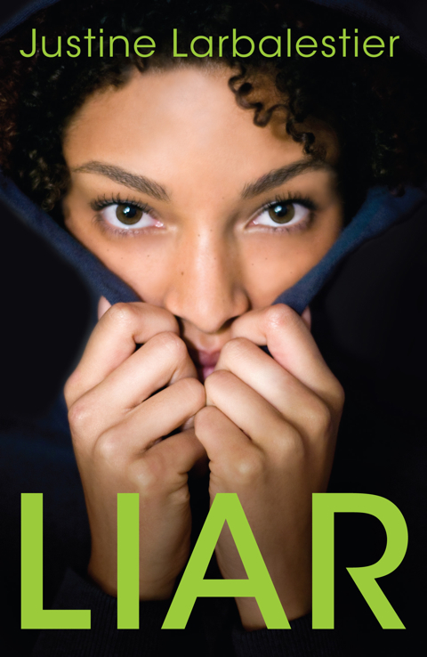
As you’ve probably heard by now Liar is getting a new cover for its publication in October.1 First Bloomsbury considered going with the Australian jacket of Liar and specifically with the black and red version you can see here because that would be the easiest thing to do. The design already exists after all and the window to make the change was very narrow.

However, given the paucity of black faces on YA covers, and the intensity of the debate around the original Liar cover, Bloomsbury felt really strongly that a more representative approach was needed. Rather than using a stock photo, Bloomsbury went the whole hog and did a photo shoot. The gorgeous design is by Danielle Delaney (who’s also responsible for the fabulous paperback How To Ditch Your Fairy cover).

Here’s the result:

I am extremely happy to have a North American cover that is true to the book I wrote. I hope you like it as much as I do. I also hope we can prove (again) that it’s simply not true that a YA cover with a black face on the cover won’t sell. But let’s also put it to the test with books written by people of color. You don’t have to wait to grab your copy of Coe Booth’s Kendra2 or any of the many fabulous books recommended by Color Online etc.

Update: I have turned comments off because there has been an uptick in people attempting to comment merely to berate others.

  1. No, it’s not actually out yet. []
  2. Have I mentioned that I really love this book? []

Cover Change

As you may have already discovered if you read Publisher’s Weekly‘s “Children’s Bookshelf,” Bloomsbury is rejacketing the hardcover edition of Liar. My wish came true much sooner than I expected. Thank you to everyone who expressed your concerns. Thank you to Bloomsbury for listening.

As soon as the jacket is final, which should be soon, I’ll be posting it here. Yes, I was involved in the cover design process.

I am delighted that my post about the original Liar jacket got some traction. But everything I said there had been said many times before by authors and bloggers of colour. Whitewashing of covers, ghettoising of books by people of colour, and low expectations (reflected in the lack of marketing push behind to the majority of those books) are not new things. The problem is industry-wide.

I’m seeing signs that publishers are talking about these issues, and I’m more hopeful for change than I have been in a long time. However, as many people have been saying, we consumers have to play our part too. If you’ve never bought a book with someone who isn’t white on the cover go do so now. Start buying and reading books by people of colour. There are so many wonderful books being published right now, such as Coe Booth’s Kendra and M. Sindy Felin’s Touching Snow. Color Online is a wonderful place to find more suggestions as are all the blogs linked to in this paragraph.

Happy reading.

PS If you’re too broke to be able to buy any new books right now don’t forget about your local library. Or you could enter this contest to win A Wish After Midnight by Zetta Elliott.

Quickly

The response to yesterday‘s post has been astonishing. I am overwhelmed. I received more mail in a single day than I normally do in a month. (I was already behind with my mail.) I’m going to try very hard to get to it all, but it may take some time and I have a novel to finish and leave the country in a couple of days. So bear with me.

Thanks so much for taking this conversation further. It’s crucial.

Ain’t That a Shame (updated)

In the last few weeks as people have started reading the US ARC of Liar they have also started asking why there is such a mismatch between how Micah describes herself and the cover image. Micah is black with nappy hair which she wears natural and short. As you can see that description does not match the US cover.
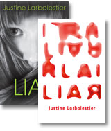
Many people have been asking me how I feel about the US cover, why I allowed such a cover to appear on a book of mine, and why I haven’t been speaking out about it.

Authors do not get final say on covers. Often they get no say at all.

As it happens I was consulted by Bloomsbury and let them know that I wanted a cover like the Australian cover, which I think is very true to the book.1 I was lucky that my Australian publisher, Allen & Unwin, agreed with my vision and that the wonderful Bruno Herfst came up with such a perfect cover image.
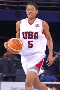
I never wanted a girl’s face on the cover. Micah’s identity is unstable. She spends the book telling different version of herself. I wanted readers to be free to imagine her as they wanted. I have always imagined her looking quite a bit like Alana Beard,2 which is why I was a bit offended by the reviewer, who in an otherwise lovely review, described Micah as ugly. She’s not!3

The US Liar cover went through many different versions. An early one, which I loved, had the word Liar written in human hair. Sales & Marketing did not think it would sell. Bloomsbury has had a lot of success with photos of girls on their covers and that’s what they wanted. Although not all of the early girl face covers were white, none showed girls who looked remotely like Micah.

I strongly objected to all of them. I lost.

I haven’t been speaking out publicly because to be the first person to do so would have been unprofessional. I have privately been campaigning for a different cover for the paperback. The response to the cover by those who haven’t read Liar has been overwhelmingly positive and I would have looked churlish if I started bagging it at every opportunity. I hoped that once people read Liar they would be as upset as I am with the cover. It would not have helped get the paperback changed if I was seen to be orchestrating that response. But now that this controversy has arisen I am much more optimistic about getting the cover changed. I am also starting to rethink what I want that cover to look like. I did want Bloomsbury to use the Australian cover, but I’m increasingly thinking that it’s important to have someone who looks like Micah on the front.

I want to make it clear that while I disagree with Bloomsbury about this cover I am otherwise very happy to be with them. They’ve given me space to write the books I want to write. My first book for them was a comic fairy book that crossed over into middle grade (How To Ditch Your Fairy). I followed that up with Liar, a dark psychological thriller that crosses over into adult. There are publishers who would freak. No one at Bloomsbury batted an eye. I have artistic freedom there, which is extraordinarily important to me. They are solidly behind my work and have promoted it at every level in ways I have never been promoted before.

Covers change how people read books

Liar is a book about a compulsive (possibly pathological) liar who is determined to stop lying but finds it much harder than she supposed. I worked very hard to make sure that the fundamentals of who Micah is were believable: that she’s a girl, that she’s a teenager, that she’s black, that she’s USian. One of the most upsetting impacts of the cover is that it’s led readers to question everything about Micah: If she doesn’t look anything like the girl on the cover maybe nothing she says is true. At which point the entire book, and all my hard work, crumbles.

No one in Australia has written to ask me if Micah is really black.

No one in Australia has said that they will not be buying Liar because “my teens would find the cover insulting.”

Both responses are heart breaking.

This cover did not happen in isolation.

Every year at every publishing house, intentionally and unintentionally, there are white-washed covers. Since I’ve told publishing friends how upset I am with my Liar cover, I have been hearing anecdotes from every single house about how hard it is to push through covers with people of colour on them. Editors have told me that their sales departments say black covers don’t sell. Sales reps have told me that many of their accounts won’t take books with black covers. Booksellers have told me that they can’t give away YAs with black covers. Authors have told me that their books with black covers are frequently not shelved in the same part of the library as other YA—they’re exiled to the Urban Fiction section—and many bookshops simply don’t stock them at all. How welcome is a black teen going to feel in the YA section when all the covers are white? Why would she pick up Liar when it has a cover that so explicitly excludes her?

The notion that “black books” don’t sell is pervasive at every level of publishing. Yet I have found few examples of books with a person of colour on the cover that have had the full weight of a publishing house behind them.4 Until that happens more often we can’t know if it’s true that white people won’t buy books about people of colour. All we can say is that poorly publicised books with “black covers” don’t sell. The same is usually true of poorly publicised books with “white covers.”

Are the big publishing houses really only in the business of selling books to white people? That’s not a very sustainable model if true. Certainly the music industry has found that to be the case. Walk into a music store, online or offline, and compare the number of black faces you see on the covers there as opposed to what you see in most book stores. Doesn’t seem to affect white people buying music. The music industry stopped insisting on white washing decades ago. Talented artists like Fats Domino no longer needs Pat Boone to cover genius songs like “Ain’t That a Shame” in order to break into the white hit parade. (And ain’t that song title ironic?)

There is, in fact, a large audience for “black books” but they weren’t discovered until African American authors started self-publishing and selling their books on the subway and on the street and directly into schools. And, yet, the publishing industry still doesn’t seem to get it. Perhaps the whole “black books don’t sell” thing is a self-fulfilling prophecy?

I hope that the debate that’s arisen because of this cover will widen to encompass the whole industry. I hope it gets every publishing house thinking about how incredibly important representation is and that they are in a position to break down these assumptions. Publishing companies can make change. I really hope that the outrage the US cover of Liar has generated will go a long way to bringing an end to white washing covers. Maybe even to publishing and promoting more writers of color.

But never forget that publishers are in the business of making money. Consumers need to do what they can. When was the last time you bought a book with a person of colour on the front cover or asked your library to order one for you? If you were upset by the US cover of Liar go buy one right now. I’d like to recommend Coe Booth’s Kendra which is one of the best books I’ve read this year. Waiting on my to be read pile is Shine, Coconut Moon by Neesha Meminger, which has been strongly recommended to me by many people.

Clearly we do not live in a post-racist society. But I’d like to think that the publishing world is better than those many anecdotes I’ve been hearing. But for that to happen, all of us—writers, editors, designers, sales reps, booksellers, reviewers, readers, and parents of readers—will have to do better.

Update: Because some recent commenters haven’t heard that Bloomsbury have changed the cover here is a link to the new cover.

  1. I didn’t see the Australian cover until after the US cover was finalised. []
  2. Yes, another protag of mine who looks like a WNBA player. What can I say? I’m a fan. []
  3. If you’re interested, I imagine another character in the book, Sarah, as looking like a younger Rutina Wesley, who’s not a WNBA player. []
  4. And most of those were written by white people. []

They’re Just Girl Books. Who Cares?

Sometimes I think the best course of action for me is to simply not read anything in the New York Times about books by women. I just wind up cranky.

Today’s piece by Janet Maslin on this summer’s books by women was astonishing. On the one hand there’s this:

The “Commencement” characters are savvy about, among other things, feminism and publishing. “When a woman writes a book that has anything to do with feelings or relationships, it’s either called chick lit or women’s fiction, right?” one of them asks. “But look at Updike, or Irving. Imagine if they’d been women. Just imagine. Someone would have slapped a pink cover onto ‘Rabbit at Rest,’ and poof, there goes the … Pulitzer.”

They’re right of course. But this is the season when prettily designed books flood the market and compete for female readers.

Too true. Women’s books are routinely lumped together even when they’re vastly different. They’re not deemed to be proper literature just because they’re written by women. And apparently this is especially true in summer which is a time “when literary and lightweight books aimed at women become hard to tell apart.”

So Maslin agrees that women’s writing is frequently compartmentalised and dismmissed. And yet she proceeds to do exactly that for for the rest of the article by lumping together eleven vastly different books and finding tenuous connections between them. All of it under the heading The Girls of Summer. Bless you, sub editor for spelling it out: it’s an article about the frivolous time of year and the frivolous gender. All is clear.

Where is the NYT piece on the boys of summer? That lumps together vastly different books by men. Oh, silly me, that would never happen because boys write real books and girls write summer fluff which is pretty much identical despite the different subject matter:

Amid such confusion, here’s a crib sheet for this season’s crop of novels and memoirs. It does mix seriously ambitious books (“Shanghai Girls”) with amiably schlocky ones (“Queen Takes King”) and includes one off-the-charts oddity (“My Judy Garland Life”). It’s even got a nascent Julia Roberts movie. But the common denominator is beach appeal, female variety. Each of these books takes a supportive, girlfriendly approach to weathering crises, be they global (World War II) or domestic (dead husband on the kitchen floor), great or small.

Let me repeat the key bit: “the common denominator is beach appeal, female variety.”

What now?

I’m confused. Is Maslin saying that no matter what subject these women write about their books are automatically light disposable beach reads because women wrote them? Or is she saying they’re automatically beach reads because of the way the publisher has decided to package the book:

Their covers use standard imagery: sand, flowers, cake, feet, houses, pastel colors, the occasional Adirondack chair. Their titles (“Summer House,” “Dune Road,” “The Wedding Girl,” “Trouble”) skew generic. And they tend to be blurbed exclusively by women.

If only the publishers had given them serious covers with non-generic titles and got a bloke to blurb them then Maslin would have been able to review their books separately and not as “women’s fiction”. Damned publishers confusing poor critics’ brains.

I think my head just exploded.

Magic’s Child in Brazil & Japan

Just arrived from the fabulous Whitney Lee: Brazilian (Editora Record) and Japanese (Hayakawa) editions of Magic’s Child. This means there are now complete sets of the trilogy in Australia, Brazil, Germany, Japan & the US of A. W00t!

Very happy making indeed. I really adore all the different covers the trilogy has gotten around the world. I still love the German ones best. Though the Japanese and Brazilian ones are a very close second. I like that the Japanese designs are so strongly influenced by events and characters in the book. While the stylised clean design of the Brazilian covers is just gorgeous. And also reflects the books quite accurately.

Here’s the two different Magic’s Child covers. The Japanese cover is on the right:

And here’s the Brazilian editions of the whole trilogy:

And the Japanese versions:

I love them all. What do you think?

Tale behind the joke Weasel cover + PSA

Thanks to everyone for playing along with mine and Scott’s joke yesterday. It was very kind of you.

Here’s how it happened:

Ever since I showed Maureen Johnson the US cover art for Liar she has taken to pushing her hair across her month and making her eyes go wide.

So I took a photo. A very bad photo. Then I thought it would be fun to make it look like the Liar cover and post it here claiming that my publisher had decided to change the cover. Sadly, I does not have photoshop on my computer so I gave it to Scott to do.

He ignored my instructions and invented the new Maureen Johnson book Weasel. Naughty Scott!

I laughed my arse off. Then I sent it to Maureen for permission to post. She said, “plz!” Then I posted, hoping you’d all enjoy the joke as much as we did.

My apologies to anyone who thought it was for real. Honestly we did not intend to trick anyone. Was solely for the giggles.

Brooke Taylor supplied some more tee hees:

Oh noes! Another lying Maureen Johnson cover! She must be stopped!

And in late breaking news I have found the perfect way to stop her. Maureen Johnson has just publicly declared that if her next book: the paperback edition of Suite Scarlett (which comes out in cheap cheap paperback on 1 May 2009) hits the bestseller list she will GO TO TRAPEZE SCHOOL.

I encourage every single one of my readers to buy Suite Scarlett on 1 May. Even if you were thinking of buying one of my books. Don’t! Buy hers instead. I want her to suffer. I need her to suffer.

Send Maureen to TRAPEZE SCHOOL!

This has been a Public Service Announcement.

Cover theft? You decide (updated)

I don’t know if any of you have noticed but there are quite a few covers in YAland that look alike. Lately there have been so many covers with girl’s faces that I admit I’ve been a little concerned that the US cover of Liar will get lost. But people have been reassuring me that it’s different to the other girl face covers, that it will pop.

Then someone anonymously emailed me the image you see below. Apparently it’s the cover of a forthcoming Maureen Johnson book.

Am I being oversensitive in thinking it looks more than a bit like the US Liar?

You can be honest with me. Do you see any similarities between this:

And this:

What do you think?

Are they the same? Could it have been done on purpose? Or maybe the two designers just happened to use the same stock photo?

Update: Full story is here.

The USian cover of Liar (Updated)

Remember way back on Wednesday when I previewed the Oz cover of my next novel, Liar? Well, now it’s time to have a squizz at what my publisher in the US of A came up with. This cover was so well received by sales and marketing at Bloomsbury that for the first time in my career a cover for one of my books became the image used for the front of the catalogue. Front of the catalogue! One of my books! Pretty cool, huh?

Apparently all the big booksellers went crazy for it. My agent says it was a huge hit in Bologna. And at TLA many librarians and teenagers told me they adore this cover. In fact one girl said she thinks the US cover of Liar is the best cover she’s ever seen! Wasn’t that sweet of her?

So here it is, the USian cover of Liar:

It was designed by Danielle Delaney the genius responsible for the paperback cover of How To Ditch Your Fairy. Have I mentioned that’s my fave cover I’ve ever had?

Here’s hoping this cover helps Liar fly off the shelves in North America!

What do youse lot think?

Update: I’m shutting off the comments here because I have written a longer post about the US cover of Liar and the outrage about it. If you have something to say about the cover please say so over there.

The Australian cover of Liar

Because I don’t write graphic novels or cheat like Scott and get one of my regular novels illustrated1 the only art I get is the cover. I think that’s part of why we authors are so obsessive about the cover. And also why we get so very upset when it’s not what we were hoping for. Well, that and the fact that a cover can make or break a book.

Well, this year I’m lucky enough to have two different covers from the get go. Two pieces of art! Yay!

Why am I so lucky you ask?

Because 2009 marks the first year in which I have a book coming out at the same time in Australia and the US of A. Hence the two covers.

I never truly feel that a book is real until it has a cover. Since Liar has two it must be realer than most.

Without further ado here is the Allen & Unwin cover designed by the incredibly talented Bruno Herfst:

I love it more than I can say. It captures the book so perfectly. I asked for something spare, iconic, cool and dark. Possibly a typographical treatment. Bruno exceeded my expectations by miles. I keep staring at it cause it makes me so very happy.

There will be embossing only on the title, Liar. Won’t that pop?! Awesome.

I also think it will cross over most excellently well into the adult market. I’ve been told by several grown ups that they were a little embarrassed to be reading How To Ditch Your Fairy in public. Not a problem with this cover.

I hope youse lot like it as much as I do.

I’ll reveal the USian cover on Friday.

  1. Yes, Scott’s next book, Leviathan—out in October—is fully illustrated. Best. Art. Ever. And the rest of the book’s not bad either. []

The best cover of all time

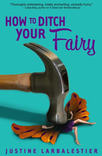
Did I mention that I have a new How To Ditch Your Fairy cover for the US paperback?

Behold:

Is it wicked of me that part of the huge pleasure I get from this cover is that mutilating barbie dolls was one of my favourite games when I was little?

I doubt that I will ever again have such a genius cover. Bless you cover gods!

Tiny change + Japanese covers

Inspired by how much fun I’ve had with the month of writing requests I’ve decided to make a few changes around here. Basically I’m no longer blogging about stuff I think I should blog about. From now on I only talk about what I want to talk about.

I always figured that I had to let you know when my books get good reviews etc. even though I find writing those posts the most boring thing in the world. Not to mention embarrassing. I always feel like I’m saying, “Hey look at me! I’m fabulous!” My heart was never in it. Thus there will be no posting about reviews of any of my books unless the reviewers raises an interesting point I want to riff on. If you’re interested in that kind of thing you can find pull quotes for each of my books in their review section. I will continue to add them as they come in.

Note: My not blogging about reviews does not mean that I’m against other writers doing so. I’m not criticising any of you. I find some writers’ discussions of their reviews fascinating, some a train wreck1, and some unreadably dull. Just like blogging about any subject really. I would never blog about cakes and yet Cake Wrecks is one of my favourite blogs.

More and more readers of this blog are here, not because they like my books, but because they like this blog. So overall I will be blogging less about the publicity aspects of my career. Though I will continue to bitch and moan and be rapturous over my struggles and joys in writing those books.

I’ll also continue to let you know about upcoming events because otherwise how will I get to meet you? But you can always check here for details.

And nothing can stop me posting about other editions of my books. Because that’s my favourite thing about being a published writer: I has books in different languages and different covers! Bliss! Joy! Happiness! For example, my foreign rights agent, Whitney Lee, just sent me links with the Japanese covers of Magic or Madness and Magic Lessons and they’re fabulous!

I love that Reason is wearing the outfit I describe her wearing and that Tom is surrounded by fabric. It’s as if the cover designer had actually read the books! Made my day! Whatcha reckon about these covers? I still love the German ones best, but these are up there.

Speaking of great covers. Just wait till you see the cover for the paperback edition of How To Ditch Your Fairy. It’s the best cover I’ve ever had. Bless you, Bloomsbury!

  1. Though that’s still fascinating. []

HTDYF in Australia (Updated)

Many of you have been asking, “When is How To Ditch Your Fairy going to be published in Australia?” I apologise for not answering. For ages I did not know if it would be or not and then it sold and I was not allowed to tell you. But now I can!

How To Ditch Your Fairy will be published in Australia in late February by the fabulous Allen & Unwin. That’s right I am now published by the same house that publishes Ursula Dubosarsky, Margo Lanagan, Garth Nix, Penni Russon and Lili Wilkinson amongst many other fabulously wonderful Oz YA writers.

What’s more A&U are not only publishing HTDYF, they’re publishing the liar book too!

Keeping this news to myself has been excruciating!

Not only will the book be coming out in Oz next Feb, which is mere months away, but I may even be doing a few appearances in support of it. Possibly in parts of Australia other than Sydney or Melbourne. More details as soon as I have them.

As you can tell I’m very excited. I feel like I’ve found a wonderful home in Australia just as I have with Bloomsbury in the USA. I hope to be with both houses for many years to come.

Update: Several people have written to ask me whether the Oz edition will have the same cover as the US one. Yes, it will. The fonts will be slightly different and “colour” and “realise” wil be spelled correctly. It will also be a paperback not a hardcover.

Charlie haz face!

And now that she has a face I’m even happier with the cover than I was before and, let me tell you, I was pretty happy. But now she’s not only escaped the headless woman curse, it’s also clear that she bears a bit of a resemblance to Leilani Mitchell of the New York Liberty, who looks exactly how I imagine Charlie would look if she wasn’t, you know, imaginary:


Copyright 2008 NBAE. Photo by Ned Dishman/NBAE via Getty Images

How To Ditch Your Fairy is almost real . . .

An ARC1 of How To Ditch Your Fairy just arrived! I am filled with squee. HTDYF is almost a real book!

Here’s what it looks like:

You know what the most fabulous part of it is? (Other than the quote from Libba Bray2 ) My name is as big as the title. My name is bigger than it’s ever been! Oh, happy day!

The happiness continues when I turn the ARC over and gaze on the back cover where there’s a marketing plan. A marketing plan!

I’ve never had one of those on the back of an ARC before. And it includes the words “multi-city author tour”. So maybe I’ll be getting to your city and have a chance to meet you later this year!

My very first author tour. Who’d’ve thunk it?

  1. Advance Reading Copy which looks like a paperback only it’s printed on heavier paper and is full of typoes. They’re printed to send out early to booksellers and librarians to get them excited about your book. []
  2. OMG! Libba Bray liked my book! []

Seen in Germany + some news

Look what I saw in an actual bookshop, RavensBuch in Friedrichshafen! Isn’t it gorgeous?:

Yup, it’s the German version of Magic or Madness. It’s even more beautiful in real life. Sigh. The book next to mine (the yellow one) is by John Marsden. Two Aussies together in Germany. I’ve been stunned by how many Aussie books I’ve been seeing in translation on our travels. Oodles of them by the likes of Trudi Canavan, Sara Douglass, Sonya Hartnett, John Marsden, Garth Nix, Marcus Zusak etc., etc. World domination!

Speaking of Germany. Random House Deutschland has just made an offer for How to Ditch Your Fairy. A very enthusiastic offer and they’ll be publishing it in hardcover. I am very happy. I met my German publishers in Bologna and they’re all lovely. Possibly because they’re all named Susanne.

This is the first time one of my books has sold to another market before publication. Very exciting. HTDYF will be out in the US in early September. And I may be sharing the cover with you some time soon . . .

Eine Kleine Madness and Magic

All three volumes of the Magic or Madness trilogy will be out in Germany in the next few months. Here’s what they look like:

These may well be my favourites out of all the trilogy’s covers.

Talk about eye-catching! She even looks a little bit like I imagined Reason looking. Though the nose is wrong, the face too narrow, and Reason doesn’t have facial tats or elf ears or blue-black hair and eyes . . . details, details.

Here’s the first page in German:

Magic or Madness in Italian


I know I said blogging about writerly achievements is tedious but I have to share when my books are translated. That’s not a writer skiting thing; it’s a publishing geek thing.

I love seeing what books are called in other markets. In this case Magic or Madness, the first book of the Magic or Madness trilogy, becomes The Revelation, book one of the Blood of the Witch trilogy.

Dark Magic is the name of the imprint. Also published on that list is none other than Margaret Mahy (!). Quite possibly the world’s finest living YA writer (along with Diana Wynne Jones). Not too shabby company, eh?

But what’s with the cat on the cover? There are no (living) cats in the trilogy! There is a key, but.

LOLYA covers contest continues

The contest is open until the end of this month (rules are here). The response has been amazing. I mean, we were hoping for at least half a dozen responses, there’s been more than fifty.

If you don’t want to spend all day being clicky with links, the lovely Lili Wilkinson has put all the covers in one place. And as more come in she’ll keep adding them. Check it out!

I have no idea how we’re going to pick winners. So many of them make me giggle. Now if only someone would do a cover in praise of zombies or that mocked uni***ns . . .

This is officially the best contest ever!

Butterflies are ubiquitious (updated)

Best book ever!Oh noes! My evil friend Shana has pointed out that butterflies are all over book covers right now. My wee Magic’s Child is just part of a trend. It’s not unique and lovely and its own sweet self! (I mean aside from the other books in the trilogy. I’m down with it looking like Magic or Madness and Magic Lesson.)

Still as book cover trends go, I’d much rather have butterflies than the dismembered women and girls that have been on the front of so many books for the past few years. You know the ones I mean? Where only torsos or feet and legs are visible. Scary headless women! Shapely legs and feet girls!

I find them all deeply disturbing. Especially as they’re frequently on the covers of some of my favourite books. Like Maureen Johnson’s wonderful Thirteen Little Blue Envelopes and the new anthology, 21 Proms which is one of my fave recent anthos with stories from some of my fave writers like Libba Bray and, well, there are too many of them to name.

Best anthology ever!I mean look at Ms Thirteen Little Blue Envelopes above. I bet she misses her head. I miss her head!

And those Prom girls? How are they going to dance with the top halves of their bodies missing? Plus wouldn’t there be blood spurting everywhere? Isn’t that a bit too Carrie? Most of the stories are funny not bloody.

I’m not saying there aren’t lovely dismembered women covers. The 21 Proms isn’t too bad at all. I’m just so very sick of them! Think of something else already. (But not butterflies. Forget about butterflies.)

What cover trends are you most annoyed by? A while back I thought that if I saw another period painting cover I’d start throwing things. They were all so obviously an attempt to suggest that the book you have in your hands is a serious and deeply worthy book, one what will win awards. How could it not with a grand master certifiably genius painting on the front?

So how about youse lot? Are there any trends in book cover designs that drive you spare?

Update: Anne Ishii of Vertical Books says that right now it’s all about the eggs.

Eggs!

Name Big=Good

I misspoke. Turns out that it’s more than possible for my name to be bigger than the title.

You can see the proper cover of Magic’s Child in the sidebar to your right. And, honestly, my name is so small you can barely even read it. How humiliating!

Now, this, this is much better:

Isn’t that a vast improvement? I likes it! I likes it a lot!

Well, okay, yes, my photoshopping leaves much to be desired. But work with me! You can see where I’m going with it, right?

You may add my name to the list of writers who dream that one day their name will be bigger than the title: “Look, Ma! That’s me! My name’s in lights!”

One day, one glorious day . . .


Hey, and this also means that Scott can have his name bigger than the title! Given that his name’s shorter than mine. Excellenter and excellenter!

Oz cover of ML

Penguin Australia decided to go with their own cover for Magic Lessons because they found the USian cover a bit too dark. At first I was miffed by this because I love love love that cover (plus they’d used one of my photos on it). Then they showed me what they’d come up with:

All miffage vanished. Isn’t it beautiful? Plus the St Stephen’s cemetery photo is by Scott.

The USian cover was designed by Marc J. Cohen and the Australian one by Cathy Larsen.

Here they are side by side:

Whatcha reckon?

Complex Character Magic or Madness

I’m in Chinese! Complex character Chinese, no less. The Taiwanese edition of Magic or Madness just arrived. Thank you, Whitney! The very first non-English edition of the book to appear anywhere in the world.

And yet another different cover for my first novel. While not as beautiful as the French cover, it does bear much more of a resemblance to the tale told within its covers. I adore seeing all these different versions of my book.

The other cool thing? It’s so skinny. What was almost 280 pages in the Oz and US editions is a mere 220 pages in this edition. Chinese complex characters are mighty efficient.

French cover of Magic or Madness

This is my first foreign language edition, published by Editions du Panama. I’m stoked! And don’t you think it looks like my name belongs there? With all those other French words? I’ve returned to my motherland! Or, okay, my great great great grandmother’s land (give or take a few greats).

Very different to the US cover, eh? I imagine the woman is meant to be Esmeralda, which fits with the title: In the Witch’s Claws.

Author Photos

I’m one of those people who’s not wild about having their photo taken. I’m not neurotic about it, like certain folk who cover their face, turn their back, or run away (how do they escape in a world where phones take pictures?). Even so, there are many things I prefer to do with my time: clean public toilets, eat thumb tacks, become a politician, ghostwrite a book for a big-name author whose work I loathe.

I blame my sister, Niki Bern. She’s a visual effects artist who’s worked on films like The Quiet American, Charlotte Gray and Matrix Reloaded. She started as a photographer.

She first caught the photography bug in her early teens. We lived in the same house, so I was her model. I was also her older sister, her mean, vicious, evil older sister who’d cruelly tormented her from the day she stopped being a cute compliant baby and started talking and expressing opinions, some of which were not in total accord with mine.

Niki picked up her first camera, looked at it, looked at me, and smiled. Revenge at last.

She started slowly, getting me to stay still just a bit longer than I’m good at (say, 45 seconds or so). “Can you hold that position?” she’d ask sweetly. “Got to check the light.” Gradually she built up my tolerance so that I was statue-like for minutes at a time while squinting into the sun as Niki barked instructions at me. Then there were the photos up trees with scratchy bark while a small boy’s soccer team watched and laughed. The Twister photos, the naked photos with hats, the romp with vicious biting cat photos.

I didn’t twig until the middle-of-winter photo session where Niki swathed me in a full-on-goth velvet dress and had me lie in a bathtub filled with cold water—she claimed anything warmer would create steam, wrecking the photos—and hold my whole body under for as long as possible. She’d taken less than ten photos before she cracked up completely. Laughed so hard she almost dropped her precious Hasselblad.

Humiliated, frozen and very wet, I finally realised what she’d been doing. I was no longer fooled by the fact that these session produced decent photos. (Actually, really good photos.) Niki had been inventively punishing me for my evil older sister ways. I deserved everything I got.

So I’m not wild about having my photo taken. But now I write books and apparently there’s a law somewhere that says all books must have author photos (APs) on the back. Apparently books with author photos sell better. I’ve been told this by almost everyone in publishing: booksellers, editors, agents, publicists, writers. But like Nathalie Rachelle Chica and Lorie Boucher I have my doubts. I’ve never been persuaded to buy a book because the author looks like a babe, though I’ve hastily put books back on the shelf because the AP was too scary.

Most author photos are hilarious. I know this because Scott and me recently spent a ridiculous amount of time peering at the back cover flap of many books in several homes, as well as a vast number at Abbey’s Books, Better Read than Dead, Galaxy Books and Gleebooks. We pulled book after book off the shelves, laughing ourselves silly and starting to hate writers who didn’t have a photo, swearing that we’d never buy any of their books because they were wasting our time. We saw so many APs our eyes almost dribbled out of our head, our jaw muscles seizing up from laughing so hard. Out of that lot we saw three that were good and ten more that weren’t too foul. The rest! Oh my.

Here’s what we learned:

Never stare straight at the camera. Not unless you really want to look like you’re in a police line up. Check out Scott’s author photo for Evolution’s Darling, an excellent example of the I-am-a-criminal-who-writes-books-on-the-side look. (Sadly, Scott wouldn’t let me scan it for the reader’s enjoyment.)

Keeps hands away from the face. Why is Rodin’s “The Thinker” the sole model for so many author photos? Especially serious non-fiction or “literary” books. For a glorious example, check out my author photo on the back of The Battle of the Sexes. No doubting that deep, deep thought went into the book: Look! She’s still frowning and her brain is so large and heavy she has to hold it up with her fist. (Sadly, I wouldn’t let me scan it for the reader’s enjoyment.)

Why did we torture ourselves looking at so many awful, try-too-hard APs? Our publisher (Penguin/Razorbill) was asking for APs of our very own. Weather and our tight schedule in NYC mean that we couldn’t get them done by Phyllis Bobb (She took our wedding photos. They were wonderful.) Instead, a good friend of Niki’s, Samantha Jones, took them. My sister swore blind she wouldn’t torture me.

She didn’t. Not too much anyway. Sam had this cunning plan. She used whoever wasn’t being photographed as her asssistant, which meant we had to hold up the big sun deflector thingie, our arms slowly developing pins and needles and falling off. All of a sudden having our AP taken seemed like motza fun. Well, okay, not, but less foul. Sam was a very calming influence and managed to distract me from thoughts such as, “Is this the kind of expression that will make lots of people want to buy my book? Or will it make them run screaming from every bookshop in the land?”

We kept our hands away from our faces and looked anywhere but at the camera. And the photos were great.

At least I thought they were until a few days later, when we went through each one carefully deciding which we could live with on the back of our books. This elicited such observations as:

“No way. My forehead’s practically glowing.”

“It looks like I’m smelling that dog shit you trod in.”

“There’s no nose in that photo.”

“Way too smug. Who’s going to buy a book written by some smug bastard?”

“Are you kidding? Not that one. Looks like my bladder’s about to burst.”

The process of elimination was dead easy. The few remaining photos, those without glowing foreheads but with noses, we sent off to New York.

That’s when I had my stunning realisation (to me—I can be a bit slow). It wasn’t the photos that were a problem, but the context. We both look great in most of our wedding photos because we were happy as hell and not thinking about what effect those pictures would have on our future economic well-being. Author photos are used to help sell books. That’s why most of them are hilarious. Serious literature can’t have a smiling or giggling author. A goofy book has to have a smiling or giggling author. Being on the back of a book makes any photo look bad, no matter how good it might be elsewhere. Beggars never look good.

APs are a mug’s game.

Sydney, 29 March 2004